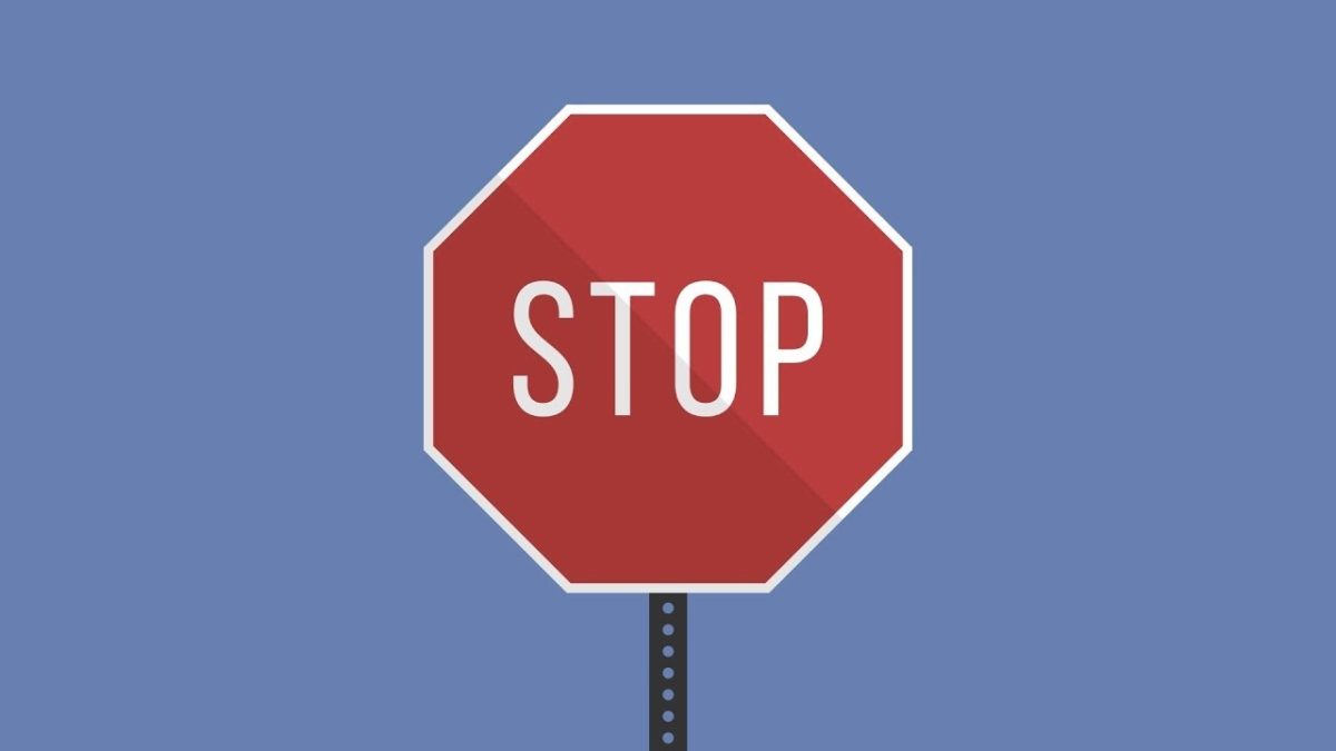
Research has shown how important it is to develop an app for app development that is user-friendly. If you don’t do this, users will get annoyed, delete your app, or go to the competitor. You can prevent this! Therefore, read here the stop signs that are most ignored in app development:
Stop sign 1: App development with too many functions
As you can also read in the article about “feature creep”, a common mistake is always coming up with new functions. As an app entrepreneur you think; “This is also fun.”, “Isn’t this part of my app?” and “With a small adjustment, this function can still be added!”. That’s the wrong setting! Try to keep thinking about the main goal and core function of the app. The point is that this feature works in full glory.
The consequences of ignoring the stop sign include:
- The user is overwhelmed with features and gets confused
- the user gets the impression that the app too complicated is
- You create additional costs for the development of your app that are not needed
Stop sign 2: App development that does not use app etiquette
When creating an app you use a kind of app etiquette. A user is used to the way an app works. Even if you open an app, you have expectations of how an app should work. If not, your users will also get frustrated. Apple and Google both provide guidelines on these etiquettes.
Examples are:
- Not using hidden elements prevents the user from finding options of the app.
- Texts that look like links, but are not, cause the user to click on texts that don’t point anywhere.
- Adding parts that look like buttons give the impression that there is an action behind it.
“By not providing the user with information on first use, it is not clear what will happen or how the app should be used.”
Stop sign 3: App development that is available in one language
50% of the turnover of the top 10 apps comes from a non-English speaking country. So making your app available in English only so that it can be used internationally is only half the story. If you want to disable your app in Germany or Norway, it is important to also add the languages from these countries to an app. Using your app is more friendly and pleasant for these target groups.
Stop sign 4: App development that throws users deep
If there is no explanation or instructions with or in your app, a user has no idea what to do with your app. When looking at game apps, there are often clear instructions on how the game works. If you are using Candy Crush for the first time and there is no indication of the purpose or how to play this game app, then you will quickly quit. This applies to every app. By not giving instructions to the user, he does not know what is going to happen or how to use the app. It is also important that the instructions are clear. Users are not going to read an abundance of information, then they close the app and delete it. Or better yet, make sure the app is clear that it explains itself. Good explanation is then even less necessary.
“An app has to work both horizontally and vertically.”
Stop sign 5: App development for one screen ratio
There are countless devices that apps run on; tablets, laptops, iOS, Android etc. All these devices use a different format. By developing an app for one screen size, you limit your app. For example, you also have to take into account the rotation of screens: depending on the usage situation, an app must work both horizontally and vertically. If you do not add this option, you ensure that a user does not have the choice to use the screen in his favorite way. And you exclude many phones with a different screen ratio from a pleasant user experience. Due to the very different phones from Android, it is a big stop sign especially for this platform.
Stop sign 6: App development that is not consistent
This stop sign sounds quite logical, but you can make the mistake quickly without realizing it. An app must communicate and work as the user is used to. Certainly in language use there is often inconsistency.
Examples are:
- Using multiple words for the same action or part. For example, it is not good to refer to a “list item” at one time and to “choice option” at other times.
- Use the same word for different parts in the app. For example, you can refer to “the menu” but there are several menus in your app.
Stop sign 7: App development that does not give standard options
Give a user a choice of different actions. Think of it as a multiple choice question. If you ask an open question, answering takes more time for the user. With multiple choices, the answer is actually already given. If you use a drop-down menu in your app or simply a number of buttons, this speeds up interaction and the user does not have to think about all the options. If your app lacks standard options, but only offers open input fields, for example, this confuses the user and does not know which answer is appropriate. This way, the user of your app comes through your app in a nice ‘flow’.
Stop sign 8: App development with buttons that are too small
If you use very small buttons in your app, the user can click on the right. Think about it, if you click a button and nothing happens, what do you think? You then assume that the app is not working properly. You can avoid this problem by using large buttons. We also call this the ‘fat-finger problem’; you can imagine something about that.
At each stop sign, ask yourself, “How would I like to use an app that has this problem? What is my response to this?” This also applies to your app. Always keep the end user in mind. Or better yet, test with users! This should ultimately use your app with pleasure and not with frustration. By listening to these stop signs you have more control over the success of your app!